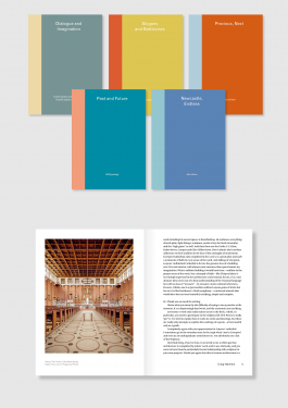
Canalside Press Essay Series
Design of new essay series of smaller, text based books for Canalside Press. The colours used were inspired by Sanzo Wada's A Dictionary of Color Combinations.
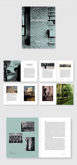
On Intricacy
A collection of essays and work by the architect John Meunier. Most of the images available were quite small so a grain effect was used in order to allow full page images on the cover and chapter openers. The balance between serif headings and sans body text illustrates the architect’s approach to architecture, drawing from different influences. Available from Canalside Press.
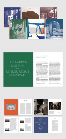
Journal of Civic Architecture
Design for a new biannual publication edited by Patrick Lynch, published by Canalside Press. First issue released in June 2018.
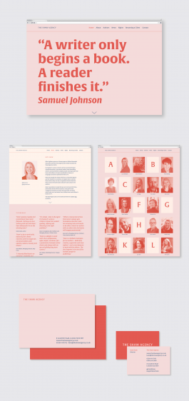
The Shaw Agency
Website and identity for a new literary agency formed by Kate Shaw. Alverata was chosen as the typeface – a modern “literary” serif. For the website a typographic approach, using large quotes, compensated for lack of imagery. A limited colour palette was used to create uniformity over a range of supplied author photos and book covers.
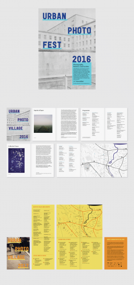
Urban Photo Fest identity
Inspired by existing signage in Deptford, where the festival is based, the identity uses thick underlines, suggesting a physical support to the typography. Each year an image from the festival is chosen that demonstrates the theme, with a change of colour to refresh the brand.
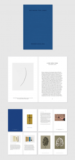
Between the Lines
Design and editing of a book about the work and teaching of artist Roger Ackling. The book is small for an art book, as the artist liked objects that could be held easily. The cover is cloth bound with blind embossing – a quiet cover for a thoughtful artist. 272 pages. Published by Occasional Papers in December 2015.
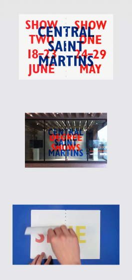
Central Saint Martins Degree Shows
with Kate Brangan
As this was the first year the shows were going to be split into two, we decided to use this as the basis for our design. Once the system was set up, it was applied to a variety of different outcomes, such as window vinyls, printed invitations and moving image. The invitation uses perforations so that the two shows are connected through the bridging “Central Saint Martins” but the individual shows can also be separated, with the words Central Saint Martins wrapping around on the back on separation.